
Friday, 23 March 2018
Magazine Cover Analysis
Wednesday, 7 March 2018
Audience Questionnaire Results


When the audience was asked what part of the trailer they enjoyed most said they enjoyed the end. This is because they are left with a cliffhanger which makes them want to find out more.

When the audience was asked if they thought the music featured in the trailer added tension most said yes. This tells us that audience know the purpose of the music was to add tension.

When the audience was asked if they would watch the full production after watching the trailer and most said yes. This shows that our trailer was a success as the audience enjoyed watching it.
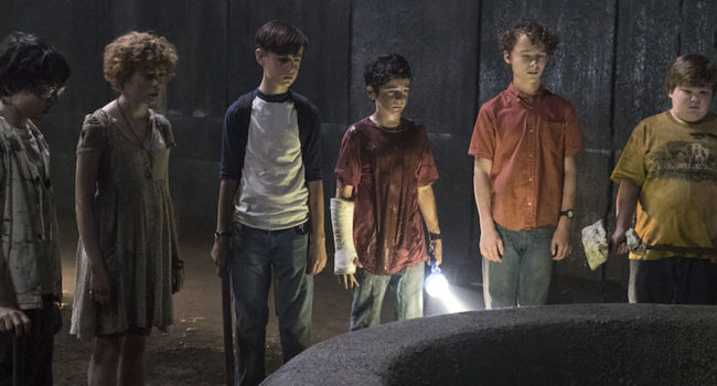
Thursday, 1 March 2018
Narrative
The narrative is the different elements which structure the story line and help with the process of the story. The narrative tends to tie together the characters, obstacles the characters face and the actions.
In our trailer "Smile" the effect the structure has on the audience keeps them interested throughout the trailer Our narrative is shown in many different ways. One of the ways is having the first scene of the trailer in an everyday setting which makes seem like a normal day. This is a stereotypical convention of a horror film as this makes the audience think everything is fine and nothing strange or unexpected is going to happen. The next part is the equilibrium which is the argument between my character and Kiera which causes a disturbance for the audience as they didn't expect this to happen because they thought everything was normal. The reason for the equilibrium is to make the audience curious of what is going to happen next and later on in the film. The complication stage in our trailer is when Kiera thinks she has seen Ellie sat up against a tree with severe wounds on her face. Usually trailers ends with a resolution but we decided to end ours with an open ending. This allows the audience to think of what is going to happen and captivates them to watch our film.
Tuesday, 27 February 2018
Codes and Conventions
In our trailer "Smile" the genre is established by using codes and conventions in the trailer, film poster and the magazine front cover.
In the trailer we have used a range of props which helped us make it look more like a horror film. One of the props we used was fake blood which we put on Ellie's face to make the wounds look realistic and this also links to the stereotypical conventions of a horror film. We also made sure that all the characters wore casual clothes
In are film we have used probs to make it look more like a horror film for example we used fake blood to show wounds on ellie face which makes it look more scary and more like a conventions horror film, another thing that we did was that we made all the actor where caular clothing to make it look more natural and so that the audience can relate to the film more.
Influences
When creating our trailer we were influenced by other horror films and took inspiration from these. The film Bad Samaritans was one of the films we found some inspiration from. This was for the wounds on Ellie's face as in the trailer for Bad Samaritans that one of the female characters has wounds on her face that are similar to ones Ellie has. Another film we found inspiration from was IT as the characters in the film wear casual clothing which allows the audience to relate to them. Also this film is a horror so the producers want the film to be as believable as it can.
Brand Identity
We created our brand identity through our film title. We decided to create our title in a unique way so that the audience remember it more and that it will grab there attention when walking past it. Another way of showing brand identity is are slogan which is " dont be fooled by the smile" this is featured in the trailer and on the film poster. By having the slogan it is away of getting the audience to want to watch the film more and also a way of the audience remembering the film.
We also kept the colour scheme the same on the poster which are red, black, white and grey. We decided to use dark colours as this relates to the horror genre. The name of our film "SMILE" is the key factor of the film and we made it unique by have the "i" to look like a smiley face.
We also kept the colour scheme the same on the poster which are red, black, white and grey. We decided to use dark colours as this relates to the horror genre. The name of our film "SMILE" is the key factor of the film and we made it unique by have the "i" to look like a smiley face.
Questionnaire for the Audience
1. Do you think that the film trailer feels like a conventional horror trailer?
Yes No
2. What part of the trailer do you think is the most effective?
Beginning Middle End
3. Do you think that the music add any tension to the trailer?
Yes No
4. What could be improvement for next time
5. Does are trailer encourage you to watch the full production of the film?
Yes No
Subscribe to:
Posts (Atom)
Magazine Cover Analysis
This is the analysis of out magazine front cover. The parts I have analysed are mentioning the title of the magazine and that the bold wri...
-
 When the audience was asked if our trailer is conventional to the genre most agreed. This tells us that the trailer was a success but so...
 -
1. Do you think that the film trailer feels like a conventional horror trailer? Yes ...
-
We created our brand identity through our film title. We decided to create our title in a unique way so that the audience remember it more a...