Tuesday, 27 February 2018
Codes and Conventions
In our trailer "Smile" the genre is established by using codes and conventions in the trailer, film poster and the magazine front cover.
In the trailer we have used a range of props which helped us make it look more like a horror film. One of the props we used was fake blood which we put on Ellie's face to make the wounds look realistic and this also links to the stereotypical conventions of a horror film. We also made sure that all the characters wore casual clothes
In are film we have used probs to make it look more like a horror film for example we used fake blood to show wounds on ellie face which makes it look more scary and more like a conventions horror film, another thing that we did was that we made all the actor where caular clothing to make it look more natural and so that the audience can relate to the film more.

Influences
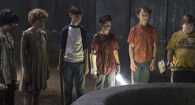
When creating our trailer we were influenced by other horror films and took inspiration from these. The film Bad Samaritans was one of the films we found some inspiration from. This was for the wounds on Ellie's face as in the trailer for Bad Samaritans that one of the female characters has wounds on her face that are similar to ones Ellie has. Another film we found inspiration from was IT as the characters in the film wear casual clothing which allows the audience to relate to them. Also this film is a horror so the producers want the film to be as believable as it can.
Brand Identity
We created our brand identity through our film title. We decided to create our title in a unique way so that the audience remember it more and that it will grab there attention when walking past it. Another way of showing brand identity is are slogan which is " dont be fooled by the smile" this is featured in the trailer and on the film poster. By having the slogan it is away of getting the audience to want to watch the film more and also a way of the audience remembering the film.
We also kept the colour scheme the same on the poster which are red, black, white and grey. We decided to use dark colours as this relates to the horror genre. The name of our film "SMILE" is the key factor of the film and we made it unique by have the "i" to look like a smiley face.
We also kept the colour scheme the same on the poster which are red, black, white and grey. We decided to use dark colours as this relates to the horror genre. The name of our film "SMILE" is the key factor of the film and we made it unique by have the "i" to look like a smiley face.
Questionnaire for the Audience
1. Do you think that the film trailer feels like a conventional horror trailer?
Yes No
2. What part of the trailer do you think is the most effective?
Beginning Middle End
3. Do you think that the music add any tension to the trailer?
Yes No
4. What could be improvement for next time
5. Does are trailer encourage you to watch the full production of the film?
Yes No
Sunday, 25 February 2018
Final Magazine Cover

The image above is our final magazine cover. The cover features all the things that are expected to be on film magazine including other movies coming out, interviews with actors and unseen pictures from our film Smile. We decided to use the image of Ellie's character when she awoke from the dead as this was the most intense and effective scene in our trailer and is also the main part of the trailer. Also the audience gets a closer look at the wounds on her face which makes it seem more like a film poster and will capture the audiences attention and gives them a vague idea on what the film is about. We used different shades of red and different font sizes for the parts that are the most important in the bigger font which is effective as our film is a horror the use of red writing represents blood. We changed the direction of each title to make it different film magazines and to also help draw in the audiences attention.
Friday, 23 February 2018
Film Poster

This is the poster for our film Smile. We decided to do the poster in black and white as we wanted to do something different and to make the title to stand out. At the top of the poster is the names of the main characters starring in the film and is in white writing so that its clear for the audience to read. The slogan which says "don't be fooled by the smile" is in bold black writing which makes the audience curious on what the film is about.
One of the most important things to include in a film poster is the release date as this informs the audience when it will be available to watch in cinemas. We decided on the 25th of October 2018 for our film to be released which is a few days before Halloween which is a good time for our film to be released as it is a horror. At the bottom of the poster is the production credits. This includes the names of the production companies, the director, the writer, who the music was done by and the costume designer. We decided to go with the image on the poster as the figure holding the missing poster remains unknown as a hood is covering their face. Also by the figure holding the missing poster makes the audience wonder if they are the killer which will make them want to go and watch the film.
Wednesday, 21 February 2018
Post-Production
G321
During the G321 production our group lacked communication around when we were going to film. By not having good communication we didn't have much time to film which made the opening two minutes to be not up to a high standard. The fade to black edits featured in the opening two media were too long which caused the tension to be lost.
When cutting to the strange figure outside the window the camera shot cut closer which made the footage not flow. Also in G321 the footage doesn't look like it's from a film as the actors found it difficult to get into their characters. Also the director due to the director rushing each scene which lead us to not having much time to look back on the footage. Also the titles featured in the opening two minutes weren't up for long enough for the audience to read.
G324
My G324 production was up to a higher standard as I was in a different group which we as a group communicated more and took our time when filming and thought out each idea and scene. Also in G324 the footage was at a higher quality due to a professional camera being used and not an iPhone which was used in G321. Another improvement made in G324 was that we filmed each scene multiple times and from different angles as we wanted to capture as much as we could in each scene. Lastly the production titles shown at the start of the trailer look more realistic.
When cutting to the strange figure outside the window the camera shot cut closer which made the footage not flow. Also in G321 the footage doesn't look like it's from a film as the actors found it difficult to get into their characters. Also the director due to the director rushing each scene which lead us to not having much time to look back on the footage. Also the titles featured in the opening two minutes weren't up for long enough for the audience to read.
G324
My G324 production was up to a higher standard as I was in a different group which we as a group communicated more and took our time when filming and thought out each idea and scene. Also in G324 the footage was at a higher quality due to a professional camera being used and not an iPhone which was used in G321. Another improvement made in G324 was that we filmed each scene multiple times and from different angles as we wanted to capture as much as we could in each scene. Lastly the production titles shown at the start of the trailer look more realistic.
Subscribe to:
Posts (Atom)
Magazine Cover Analysis
This is the analysis of out magazine front cover. The parts I have analysed are mentioning the title of the magazine and that the bold wri...

-
 When the audience was asked if our trailer is conventional to the genre most agreed. This tells us that the trailer was a success but so...
 -
1. Do you think that the film trailer feels like a conventional horror trailer? Yes ...
-
 This is the analysis of out magazine front cover. The parts I have analysed are mentioning the title of the magazine and that the bold wri...