Tuesday, 27 February 2018
Codes and Conventions
In our trailer "Smile" the genre is established by using codes and conventions in the trailer, film poster and the magazine front cover.
In the trailer we have used a range of props which helped us make it look more like a horror film. One of the props we used was fake blood which we put on Ellie's face to make the wounds look realistic and this also links to the stereotypical conventions of a horror film. We also made sure that all the characters wore casual clothes
In are film we have used probs to make it look more like a horror film for example we used fake blood to show wounds on ellie face which makes it look more scary and more like a conventions horror film, another thing that we did was that we made all the actor where caular clothing to make it look more natural and so that the audience can relate to the film more.
Influences
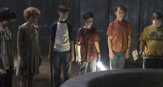
When creating our trailer we were influenced by other horror films and took inspiration from these. The film Bad Samaritans was one of the films we found some inspiration from. This was for the wounds on Ellie's face as in the trailer for Bad Samaritans that one of the female characters has wounds on her face that are similar to ones Ellie has. Another film we found inspiration from was IT as the characters in the film wear casual clothing which allows the audience to relate to them. Also this film is a horror so the producers want the film to be as believable as it can.
Brand Identity
We created our brand identity through our film title. We decided to create our title in a unique way so that the audience remember it more and that it will grab there attention when walking past it. Another way of showing brand identity is are slogan which is " dont be fooled by the smile" this is featured in the trailer and on the film poster. By having the slogan it is away of getting the audience to want to watch the film more and also a way of the audience remembering the film.
We also kept the colour scheme the same on the poster which are red, black, white and grey. We decided to use dark colours as this relates to the horror genre. The name of our film "SMILE" is the key factor of the film and we made it unique by have the "i" to look like a smiley face.
We also kept the colour scheme the same on the poster which are red, black, white and grey. We decided to use dark colours as this relates to the horror genre. The name of our film "SMILE" is the key factor of the film and we made it unique by have the "i" to look like a smiley face.
Questionnaire for the Audience
1. Do you think that the film trailer feels like a conventional horror trailer?
Yes No
2. What part of the trailer do you think is the most effective?
Beginning Middle End
3. Do you think that the music add any tension to the trailer?
Yes No
4. What could be improvement for next time
5. Does are trailer encourage you to watch the full production of the film?
Yes No
Sunday, 25 February 2018
Final Magazine Cover

The image above is our final magazine cover. The cover features all the things that are expected to be on film magazine including other movies coming out, interviews with actors and unseen pictures from our film Smile. We decided to use the image of Ellie's character when she awoke from the dead as this was the most intense and effective scene in our trailer and is also the main part of the trailer. Also the audience gets a closer look at the wounds on her face which makes it seem more like a film poster and will capture the audiences attention and gives them a vague idea on what the film is about. We used different shades of red and different font sizes for the parts that are the most important in the bigger font which is effective as our film is a horror the use of red writing represents blood. We changed the direction of each title to make it different film magazines and to also help draw in the audiences attention.
Friday, 23 February 2018
Film Poster

This is the poster for our film Smile. We decided to do the poster in black and white as we wanted to do something different and to make the title to stand out. At the top of the poster is the names of the main characters starring in the film and is in white writing so that its clear for the audience to read. The slogan which says "don't be fooled by the smile" is in bold black writing which makes the audience curious on what the film is about.
One of the most important things to include in a film poster is the release date as this informs the audience when it will be available to watch in cinemas. We decided on the 25th of October 2018 for our film to be released which is a few days before Halloween which is a good time for our film to be released as it is a horror. At the bottom of the poster is the production credits. This includes the names of the production companies, the director, the writer, who the music was done by and the costume designer. We decided to go with the image on the poster as the figure holding the missing poster remains unknown as a hood is covering their face. Also by the figure holding the missing poster makes the audience wonder if they are the killer which will make them want to go and watch the film.
Wednesday, 21 February 2018
Post-Production
G321
During the G321 production our group lacked communication around when we were going to film. By not having good communication we didn't have much time to film which made the opening two minutes to be not up to a high standard. The fade to black edits featured in the opening two media were too long which caused the tension to be lost.
When cutting to the strange figure outside the window the camera shot cut closer which made the footage not flow. Also in G321 the footage doesn't look like it's from a film as the actors found it difficult to get into their characters. Also the director due to the director rushing each scene which lead us to not having much time to look back on the footage. Also the titles featured in the opening two minutes weren't up for long enough for the audience to read.
G324
My G324 production was up to a higher standard as I was in a different group which we as a group communicated more and took our time when filming and thought out each idea and scene. Also in G324 the footage was at a higher quality due to a professional camera being used and not an iPhone which was used in G321. Another improvement made in G324 was that we filmed each scene multiple times and from different angles as we wanted to capture as much as we could in each scene. Lastly the production titles shown at the start of the trailer look more realistic.
Tuesday, 20 February 2018
Directors Commentary
The first thing we mention is the use of a dolly shot and the effect of it as it shows the setting of the first scene. The next thing we say is the use of non-diegetic music makes it more like a horror film. We then mention the location and that it is effective as this is where teenagers spend a lot of time. The next thing we say is that the argument is effective as it causes tension for the audience and that it gives the audience an idea of what the story is. We then mention about the use of titles as they come up every now and then when your least expecting them to. The use of the fade to black screens keeps the audience interested.
We then mention about the lighting as we used natural lighting as we filmed outside. The trailer is clear on what the film is about. The final point we say is the flares are effective in the trailer as it adds tension.
Wednesday, 7 February 2018
What have you learned from your audience feedback?
What have you learned from your audience feedback?
The feedback we received from the audience was very helpful. From each audience member they said one thing they liked about the trailer and one thing that we could improve on. We received a range of both comments on what they enjoyed and what could be improved.
The things that the audience enjoyed about the trailer were the use of the fake blood as it made it look realistic, the use of reviews, we followed a narrative and the theory of the use of props and location being introduced, a clear understanding of the story line, the use of close ups which showed the characters facial expressions and the final comment we got about things the audience enjoyed was the dialogue was clear for the audience to understand.
The things the audience said we could improve on were that the police officer could of worn an outfit which showed his role a bit more clearly, the footage cut out when the characters were still speaking, adding more non-diegetic soundtrack and the final comment was we could of made it clearer why the girl is missing.
Tuesday, 6 February 2018
Evaluation
In what ways does your media product use, develop or challenge forms and conventions of real media products?
For our trailer we have conformed to the stereotypes of a horror film. We have done this by including a missing person who has been killed and left with a carving on her face by the killer and having the main characters as teenagers as this is what most horror films contain. We decided to have teenagers in our film as the target audience for our trailer is teenagers both male and female so they can sympathise with them and feel a connection with the characters.
Have you subverted or conformed to stereotypes of your choice of genre?
In our trailer we have conformed to the stereotypes of a horror trailer. We have done this by using a range of camera angles a lighting which will put the audience on edge. We also used fake blood in the trailer as it is known for showing someone is in danger and we also had all the characters wear casual clothing as this is what is worn in horror films as this allows the audience to relate to them more.
Use of Sound
Throughout our trailer we have used both diegetic and non-diegetic sound. This gives the audience a chance to learn the story line and get to know the characters. At 1:20 Anna says to Kiera "your just seeing things" as Kiera thought she had just seen Ellie's dead body. The tells the audience that it's a horror film as Kiera is having hallucinations which conforms to stereotypes of a horror film as it is seen as creepy.We also used non-diegetic sound in the trailer which tells the audience about a problem that is about to occur and makes it feel more like a horror film. For example at the start of the trailer the music is eerie and tense which puts the audience on edge is makes them want to asks questions.We got the ideas on what type of non-diegetic sound to use and where about's to put it in the trailer in order to make it successful.This also adds some tension to the trailer.We did this by watching a range of horror trailers.
Take some screen shots of characters from yours and compare to screen shots from characters of other trailer. Write an analysis of the representation in your trailer.


The image on the left is the character Josh in our trailer and shows his clothes are casual. The picture on the right is of one of the characters from the film Happy Death Day and he is also wearing casual clothing. This is effective as they are both wearing casual clothing which allows the audience to relate to the characters.


The image on the left is one of the characters from Bad Samaritan and the picture on the right is of Ellie in our trailer. In both images they have severe face and head wounds which are used to add tension in the trailer.
Institution Analysis: What sort of company would have made your film? How did you create your own production titles?
If we could chose a production company to make our film Liongate would be a good choice as they have made a range of successful horror films and are targeted towards teenagers and young adults. Also New Line Cinemas has created successful horror films such as IT. We created our production titles by using our own original images and edited them on photo shop then adding the name of the production company to each one.Take some screen shots of characters from yours and compare to screen shots from characters of other trailer. Write an analysis of the representation in your trailer.
The image on the left is the character Josh in our trailer and shows his clothes are casual. The picture on the right is of one of the characters from the film Happy Death Day and he is also wearing casual clothing. This is effective as they are both wearing casual clothing which allows the audience to relate to the characters.
The image on the left is one of the characters from Bad Samaritan and the picture on the right is of Ellie in our trailer. In both images they have severe face and head wounds which are used to add tension in the trailer.
Use Of Titles
In our trailer we used titles throughout. We left the name of the film until last because this will keep the audience curious on what the film is called and the audience will remember the film. We used titles throughout the trailer which helped shape and structure our trailer as it informs the audience information about the film story line. Our trailer includes a range of titles, film credits, the film title and release date. We also feature reviews on our film which provides the audience with knowledge about our film as well as its success.
Magazine Title
 This image shows what type of font we will be using for our magazine front cover and the size of the text. We made sure that the style of font was bold so that it stands out which will capture people's attention. The text size we used is in 80pt and the style used is wide Latin
Friday, 2 February 2018
Audience Feedback on the trailer
The first comment we got was that they liked the bloody makeup as it made it look realistic. They then said that the police officer could of worn and outfit to show this was his role in the trailer. The next comment was that they liked the use of the reviews and the thing they didn't like was that the footage cut and you could still see the scenes and we should of used the fade to black effect. The next comment was that they liked the fact that we followed a narrative and the theory of the use of props and location being introduced. They said we could improve it by adding some more non-diegetic soundtrack.
The next bit of feedback we got was that it's clear that the story is about a girl who's gone missing and the main character is her best friend. They said we could've made it clearer why she is missing and how long she has been missing for. The next comment was that they liked the use of close up shots as it showed the characters facial expressions. The final comment we received was that the dialogue was clear for the audience so that they could understand the story line. And to improve it we could of included a variety of soundtracks to build up the tension.
I appreciated all of the feedback we got on our trailer. The feedback was helpful as if we were to make the trailer again we would include the what the audience said we could improve on or include to make the trailer better.
Smile Offical Trailer
This is the official trailer for our film 'Smile'. The trailer goes on for 2 minutes and 8 seconds which is around the average length of a trailer. The genre of the trailer is a horror. In the trailer you meet the protagonist and the other 3 main characters one of which is the protagonist's best friend. In the trailer the audience find out where the trailer is located.
Subscribe to:
Comments (Atom)
Magazine Cover Analysis
This is the analysis of out magazine front cover. The parts I have analysed are mentioning the title of the magazine and that the bold wri...

-
 When the audience was asked if our trailer is conventional to the genre most agreed. This tells us that the trailer was a success but so...
 -
1. Do you think that the film trailer feels like a conventional horror trailer? Yes ...
-
When creating our trailer we were influenced by other horror films and took inspiration from these. The film Bad Samaritans was one of the f...
